Custom Software Design (Step 2)
Successful custom software development projects always start by taking the right approach to process and strategy. For most companies, this process and strategy include an Exploratory Meeting, Discovery Consultation, as well as Requirements and Visualization.
By the time a cust om software developer has worked through Requirements and Visualization with a client, that client has a functioning prototype of their future system. And just as important, once the prototype is approved, the client will understand the exact, guaranteed budget required to move forward with their custom software development investment.
Then, and only then, will the custom software development team be in a position to turn its attention to design.
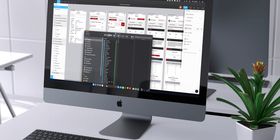
Wireframes and Prototypes for Visualizing User Requirements
While end users and line of business managers sometimes use the terms interchangeably in the context of software design, wireframes and prototypes are entirely different ways to visualize user requirements.
A website wireframe, also sometimes called a page schematic or blueprint, is a visual way to represent a website’s skeletal framework – how a website page will be arranged. Typically the culmination of both a business goal and a creative plan, wireframes arrange page elements in a way that’s all about best achieving a particular business objective. Wireframes also show how different user interface and navigation elements will interact with each other.
A website prototype is quite different in both appearances and purpose than a wireframe. Website prototypes are barebones ways to show users what their future websites or mobile apps will look like when complete. Prototypes typically have much more considered design or fidelity than wireframes.
Building Consensus Around Business Solutions
While wireframes are often about illustrating and building consensus around how a website page will look, prototypes give software designs and end users a way for users to test the planned user interface and how various elements will interact with each other.
Although some custom software designers and developers still lean heavily on building complex requirements documents to set the foundation for a project, very few users — even the internal champion within a company – are willing to read 100 or more pages of requirements.
As a way for software designers and developers to build client relationships the right way, prototypes make all the difference for visualizing user experience and are an essential prerequisite for building a successful product.
Aligning End Users, Designers, and Developers Around Business Goals
Prototypes align business end users with their developers to set the entire project up for success. Approached with the right mindset, end users love prototypes because they get to see exactly what the process flow will look like when it’s completed. And developers are big fans of prototypes because once a prototype is tested and approved, the prototype will outline what buttons, fields, and menus (components) have to exist and in what logical sequence.
For custom software projects to be successful, a company’s various stakeholders need to be confident that the initiative is proceeding correctly. Prototypes are a very important tool for alignment and help to prevent the dreaded, late-stage client feedback of “I didn’t expect that.”
A well-implemented prototyping process, which allows end users to see the solution before development begins, makes those project nightmares a thing of the past and gets everyone on the same page about the features and functionality that matters most
Design of Software (Web Apps and Mobile Apps)
Wikipedia defines web design as the many different skills and disciplines involved in the production and maintenance of websites. And Adobe has found that 38% of visitors will stop engaging with a website if the content and layout are unattractive.
Within web design, there is front-end web design and back-end web design. Front-end web design is more of the marketing tool. Back-end design relates to the software development.
Every custom web design project focuses on customer needs, but designers often struggle to understand a company’s actual needs. Design does not begin until the client’s needs are fully understood.
Responsive Website Design
As new kinds of mobile devices have surged in popularity, website designers needed to find ways to address problems created by fixed-width parameters.
TechTarget defines responsive design as a way to create website pages with flexible layouts, flexible images, and cascading style sheet (CSS) media queries.
For non-designers, think of responsive design as a design that responds well to different screens and their associated screen resolutions.
In a mobile-first world, many designers find it far easier to design first for smartphones, where there is less available screen real estate, and then design for desktop size screen resolutions. However, this is not always the best approach – especially if the website has functionality that can’t be easily replicated by mobile design.
Adaptive Website Design
Although it’s often confused with responsive design, adaptive design is entirely different. Responsive design is where there is essentially one layout that’s always changing to respond to different screen sizes.
Adaptive design, on the other hand, actually provides several different screen layouts that are designed in advance to adapt to the needs of varying screen resolutions – for example, desktop, smartphone, and tablet.
Mobile Website Design
When someone mentions mobile design, that person is typically discussing a broader category of website design that could be either responsive design or adaptive design.
Nearly all templates in the marketplace today tend to be responsive. So for the business use case perspective, mobile design is just addressing the question, “Will a website be visible on smartphones? And will the website function as intended with the desired user experience (UX).

For more complex websites or business applications, the decision isn’t just about selecting a responsive design or adaptive design. Because most responsive websites today will have mostly the same user experience on both desktop and mobile devices. That changes quite dramatically when a business has that same website developed into a mobile application for iOS or Android – the two predominant mobile operating systems.
WebView & Native Mobile App Design for iOS and Android
WebView is a hybrid mobile design and development strategy that allows a mobile application to be bundled inside of a browser. Designers and developers, in conjunction with their clients, select WebView as a way to get apps into the app stores (Apple’s App Store and Google Play) without building applications.
By opening up a browser with an adaptive or responsive view, WebView essentially fakes the mobile application experience.
While it helps companies in certain circumstances solve a speed-to-market and budget problem, WebView does not provide the ideal user experience because applications are delivered much more slowly to users.
For most companies, the right design approach isn’t about taking shortcuts with WebView, but instead designing native apps for both iOS and Android. This way each mobile app has its native controls and delivers a much more intuitive user interface (UI) and user experience.